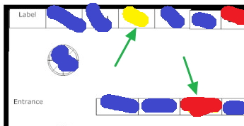
A plan for displaying merchandise used to maximise profits is called a planogram.
Now because retailers are starting to see shoppers back, many of our clients are checking their stock layouts. So many of our clients are ringing up our support about doing planograms so clearly my post on Monday about the division of stock into sales categories was interesting to our readers here.. A step by step approach to this is available here.
Before starting, look at the above diagram to see the concepts and what you will get out of these planograms.
The goal is to use your space to the maximum. So what we are going to do is visually see a plan of what is happening in your shop.
A sales report was used. We then divided the departments then divided the sales data by the linear measurement of each area and divided the result into the following groups.
Blue = Good (Top 20%)
Yellow = Average (Middle about 60%)
Red = Bad (Bottom 20%)
blank = Zero
This information was then marked on an actual shop entrance plan shown here. Now you can see how it visually shows the shop's sales information. See the two spots marked with the green arrows, particularly the red one. That is something to look at that spot; it is not pulling its weight.
It is often also interesting if you have spots in what should be in a dead area that is doing better than everything around them. Products that do well no matter where they are on the shelves are great for drawing people into the shop.
What is essential is to make two diagrams, one using profit and the second by numbers. Good products both brings people in and makes profit.
Whatever changes you make, keep the planogram and redo it in a few months to see what the changes did in your shop. Then compare the two planograms.
Now click here to start on your planograms.
Note this is only the start we recommend these planograms for shoplifting and product placements but that is a subject for another day.


