
There is a saying that a picture (graph) is worth a thousand words, and many graphs are better still. The problem is few people feel comfortable looking at rows of numbers on a graph you can see patterns and trends much easier and its not that hard to create millions of different types of graphs with our point-of-sale system.
I will do a simple one here as an example.
I decide I want to look at the department sale of Tobacco.

So I go into reports and select "Dissection Monthly Sales Trend (Graph), and I get a graph but say I wanted to do MORE. Say I want to experiment with many different scenarios; I wanted much more than a graph. This is of course where the power of our point of sale is shown. It's not just a static one-dimensional reporting tool. It can give you the flexibility to make your own reports and graphs.
So we pick the item above it the "Dissection Monthly Sales Summary"
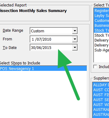
Since for this example, I will be working in whole financial years, I pick this range of five years.
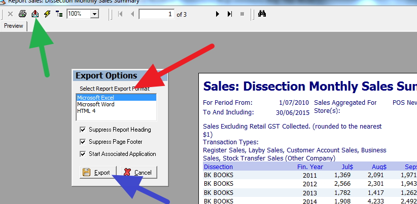
After the report comes out, I press the green button to export it to excel or openoffice which is free and very good
I do whatever I want there but in this example......
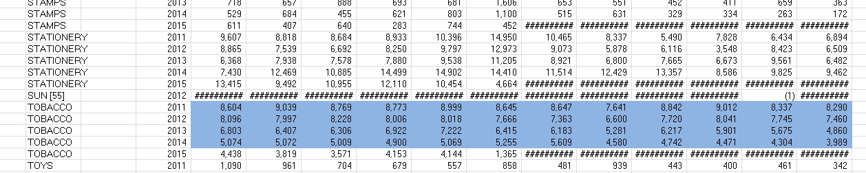
I highlight the Tobacco department.
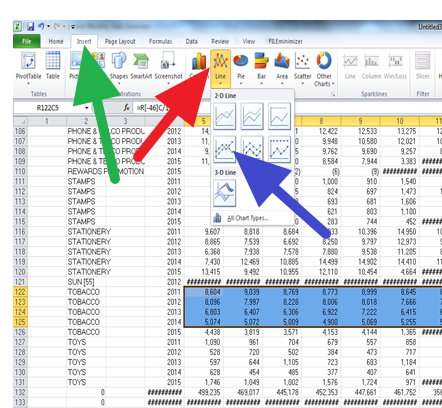
Press insert (green), Line (red) and for this case, I will use the fourth one but there are millions of different graphs available there.
And out pops my graph.
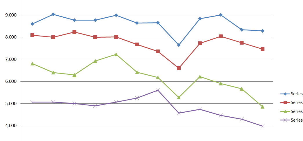
Which shows me the last five years of history. You can see its going down, down, down.
Have a shot, you will find it most useful...