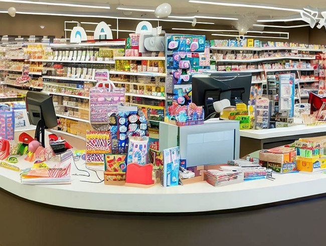
The checkout or front counter is the best and most profitable area to display stock for most clients. Just ask your suppliers where they want their stock. I am sure they will say put it on your checkout counter.
Because it is so vital the checkout counter is, its design requires careful thought.
I like these U-shaped checkouts, which offer many benefits compared to traditional straight counter layouts.
Here is an example.

Here are some advantages of this key selling area
> The checkout line is the best place for impulse sales. Shoppers there have selected items already and are ready to make purchases. U-shaped counters keep more customers in this mindset across multiple queues. This leads to greater impulse sales.
> Maximised Merchandising Display as it has more space around the counters. This extra space allows stores to merchandise more products in the high-traffic checkout zone.
> Increased Queue Capacity as the design will enable customers to line up on three sides rather than just one. This triples the queue capacity plus presents them with many products to consider.
> Increases impulse buys, as the U-shaped counters provide the perfect space to display high-margin secondary items. Things like batteries, candy, magazines, and phone chargers can catch the eye of waiting shoppers. More open space means more opportunities to entice add-on purchases.
> The U-shaped counters allow supervisors to observe all registers quickly. The layout makes the checkout team more cohesive and coordinated. From both a sales and operations standpoint, U-shaped checkouts maximise productivity.
> Makes it much easier to put many computer terminals together
Conclusion
The checkout or front counter is a crucial area for retail businesses to showcase their products and increase sales through impulse sales. It is essential that you carefully plan and design this key selling area to maximise its potential. I think you will find that a U-shaped checkout layout offers several advantages over traditional straight counter designs.


