Planning the layout of your store is quite an art. This video may give you some tips on how to improve your shop layout and design.
One point here is that Australians shoppers do move clockwise. That is why when we set sales budgets in our POS software, we make the left side of the shop more than the right side. If you are not doing this now, I suggest that you start now doing that now.
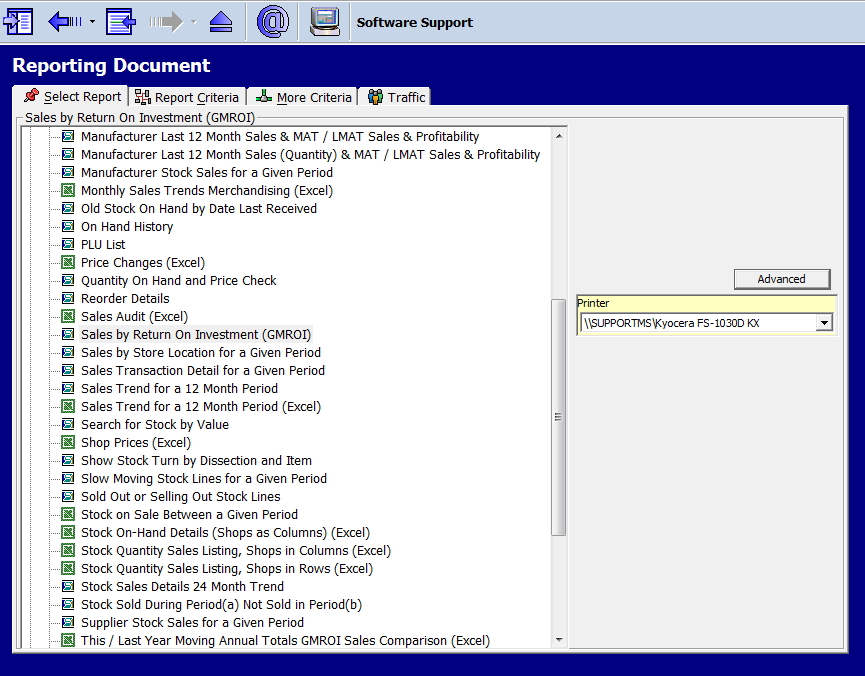
Near the front counter, the items with the highest return on investment should be there. It is easy to get a list of these go to
Cash register report > GMROI (see the selection highlighted) in your point of sale software in the reports here.

Ignore departments and see what they are. Now see how you can use them at the counter.


