Doing retail Product Line Expansion

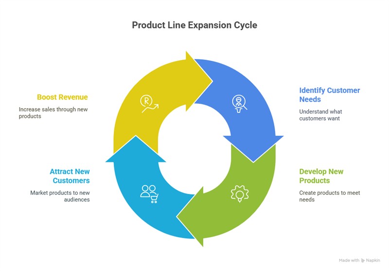
Product line expansion is a key growth strategy in retail. You have customers. What can you offer that will sell more to them? You want to attract new customers with new products. Successful implementation requires some intelligence, as we need to introduce new products thoughtfully to boost revenue.
Clothing
One new department that is doing well with my clients is clothing. It can be a profitable venture, with strong margins and consistent demand. Many find it offers an attractive opportunity to diversify their product range. Our studies show that clothing outperforms gift items in terms of profitability. Clothing is now experiencing significant growth.
Let us use it as an example of how to introduce a new line into your shop.
Clothing isn't simply about stocking random garments. It requires planning, so let's dive in.
Understanding Your Local Market
Defining Your Target Market
Successful clothing retail now depends on clearly understanding who you're selling to. Focus on specific customer segments that align with your local demographics.
Consider these key factors when defining your target market:
Age
Different age groups have distinct style preferences and shopping behaviours.
Gender
Will you focus on menswear, womenswear, or both?
Income level
This determines price sensitivity and expectations for quality
Lifestyle
Active, casual, professional, or fashion-forward
I find that making up a fictional persona helps. Let's say you identify three types of people and make them as detailed as possible to help you visualise them and identify their needs.
For instance,
- Professional women aged 45 who value quality items and comfortable, modern-style clothes. She is willing to pay for durability and versatility. Call her Debby.
- A retired 65-year-old male. Call him George. For him, clothes do not need to be fancy; they just need to be cheap.
- A 21-year-old woman named Lisa works in the local shopping centre and spends a lot on clothes.
Now ask yourself what George, Debby or Lisa would buy in your shop.
When conducting your competitive analysis, focus on:
Product ranges
What types of clothing are they buying? What you are looking for are gaps in your area.
Price points
What price points do they have in your area?
Customer demographics
Who shops there? Observe age groups, style preferences, and spending patterns.
Store layout and displays
How do they present their merchandise? What seems to attract attention?
You are trying to look for weaknesses and gaps that you can fill. The gaps do not have to be big.
For example, winter is coming up. There seems not to be much catering to cheap winter hats. You can get very cheap polyester beanies from Kmart, but not much is available if people want something made of warm wool. Maybe look into your new line for beanies, baker boy caps, bucket hats, etc..
Identifying Multiple Market Segments
Consider targeting several complementary market segments rather than focusing on a single customer type. This approach provides more stability and growth potential for your business.
Aim to identify at least three potential market ideas:
For each potential market, assess:
- Size of the potential market
- The commitment you need.
- Competition
- Alignment with your business values and capabilities
After identifying these segments, you can evaluate which offer the best opportunities and gradually narrow your focus to the most promising markets.
Finding Your Niche
Creating a Specialised Offering
The key to standing out in retail is specialisation. Rather than competing directly with department stores or chain retailers on everyday items, focus on developing a unique niche that addresses specific customer needs. A well-defined niche helps customers understand what makes your clothing selection special and gives them a reason to choose your store over alternatives.
Seasonal Strategy Example: Winter Headwear
Your example of winter headwear illustrates an innovative seasonal approach. As you noted, winter brings predictable demand for warm accessories, creating a natural opportunity to introduce a focused clothing category.
When implementing this strategy:
Start with variety
Offer different styles (beanies, newsboy caps, berets) to determine what resonates with your customers.
Quality
Select a price point; do not be afraid to be expensive. In my experience, the top and bottom are very hard to get into.
Consider timing
It is probably too late for seasonal items like winter wear, as winter is almost here.
Suppliers
Finding reliable suppliers is crucial for retail success. Clothing platforms like AliExpress can be good starting points for sourcing products. I suspect many majors, like Kmart, use them a lot. You can, too.
Supplier reliability
Check reviews, what do people say about their communication responsiveness
Product quality
I think you will do better with mid-range quality
Marketing support
It would help if they had some display materials
Delivery timelines
Very important, when can you get the goods? You must ensure sufficient lead time.
Minimum order quantities
This is often a problem when getting excellent prices. You need enormous quantities, but you don't initially want these. Make them an offer, say for 10. They can only say no. We have all heard that before in business, so I doubt it will hurt that NO.
Effective Merchandising Strategies
Creating Compelling Displays
How you display significantly impacts sales. Effective merchandising creates visual interest and helps customers envision how items look when worn.
Dedicating Proper Space
When introducing the products to your retail business, allocate sufficient space to create an impact. A few scattered items won't generate excitement.
Leveraging Social Media
If you sell products like clothing, you should be on social media. You need
- High-quality product photography that the supplier can give you.
- Give yourself a local presence, with pictures of you wearing these clothes.
- Share new arrivals as they come in
- Highlight real customers wearing your products
Ongoing Management
The sad fact is that most experiments fail. No matter how much you plan, you will have failure. You do not want to end up tying up capital in slow-moving stock.
Implement these inventory best practices:
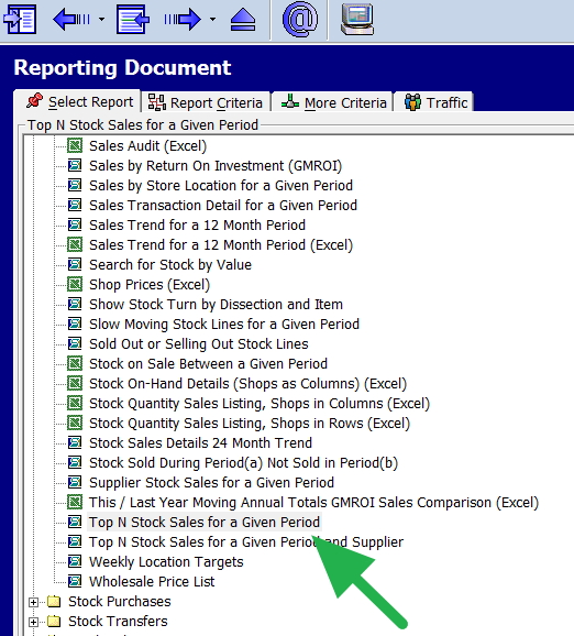
- Use your point-of-sale report to update your sales figures
- Which items sell quickly at full price?
- What feedback do shoppers provide?
- Why are items brought back? What sort of problems do you have?
- Ruthless culling of products that do not work.
Use this information to refine your product selection, adjust pricing strategies, and optimise your merchandising approach.
Conclusion
With careful planning and consistent execution, you can drive sales into your retail business.
Written by:

Bernard Zimmermann is the founding director at POS Solutions, a leading point-of-sale system company with 45 years of industry experience. He consults to various organisations, from small businesses to large retailers and government institutions. Bernard is passionate about helping companies optimise their operations through innovative POS technology and enabling seamless customer experiences through effective software solutions.


