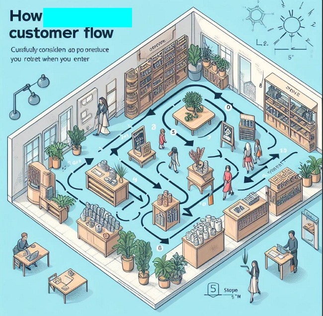
Better Customer Flow in Your Store

In your retail store, carefully considering customer flow can greatly impact sales. Customers tend to explore your store in a clockwise pattern, usually turning left first when they enter. With this in mind, here are some tips for improving customer flow in your store. This takes in most shops about 15 minutes to do.
Make the Most of the Decompression Zone
I suggest you make your way to the front left of your shop. I find it a good idea to go with someone on your journey and discuss it. This is called the decompression zone of your shop.
This is where your customer mentally shifts from the outside world to your store. Upon entry, they take stock of your store, develop an opinion of your brand, and even subconsciously judge the pieces and prices they expect to find.
Since this left front area is the first thing customers see, use it for promotional displays to grab their attention. This prime real estate is perfect for showcasing new products, sale items, or seasonal offerings, but since people are not ready to buy, do not count on them buying here. Here they are thinking about your shop and its products.
Check the Aisle Space
As you move clockwise through your store, people do not like to feel cramped when shopping. So, you should allow for ample space for movement. Aisles must be broad enough to invite customers to browse, not bump into other shoppers, and—most importantly—pick up and carry items for purchase.
No Escape Routes on Your Journey
Be careful not to allow any "escape holes" for your customers to avoid going to the back of the shop. You want them to go to the back wall and then move forward to the front.
Draw Customers In
If you have staple items that people are coming in specifically to buy, like milk, place these in the back of the shop to draw customers inside.
Checkout Placement
Generally, the front right of a retail store is the best location for the checkout counter. This placement doesn’t distract people from shopping or occupy prime product display space.
By keeping these tips in mind as you lay out your store and place merchandise, you can optimise traffic flow to maximize sales. Let customer behaviour guide your design. If you want to know more of the theory click here


